Kasia Wrona

Data Scientist at Team Internet Group PLC (LON:TIG)
Freelance Tableau Developer and Data Analytics Engineer
Data Analytics Mentor at CareerFoundry
Data visualisation professional and machine learnig enthusiast
LinkedIn Profile
GitHub Repo
Tableau Public
Portfolio
Cloud Computing
Automated Instagram Engagement Bot for Brand Awareness Campaign


A cloud-based automation project designed to boost brand awareness for a family-run business on Instagram. Built using Dockerized Android on GCP, the system runs an open-source interaction script with proxy support, scheduled via cron, and monitored via Telegram — enabling hands-free, consistent social media engagement with a business-focused goal.
Technologies: GCP, Docker, Linux (Ubuntu), Python, Cron, Telegram API, Proxies, Open-source Github Project
Machine Learning
Stock market automaded trading
An algorithm for automated stock or crypto currency trading with Alpaca Market. Implemented features: checking if market is open, scrapping current price from Yahoo, checking the latest price agains the algorithm based on short- and long-term rolling average, cloud implementation. Test version finalised with 105% of return per week.
Customer Propensity Classifier
Predict the likelihood of customer conversion based on customer behaviour. The model is trained on Kaggle "Customer Propensity to Purchase" dataset. It takes into account the imbalanced train set and performs under-sampling. There are several different "weak" classifiers, which predictions are then processed by "voting" classifier. This process creates a synergy effect with an accuracy exceeding 99%.
Visualisation
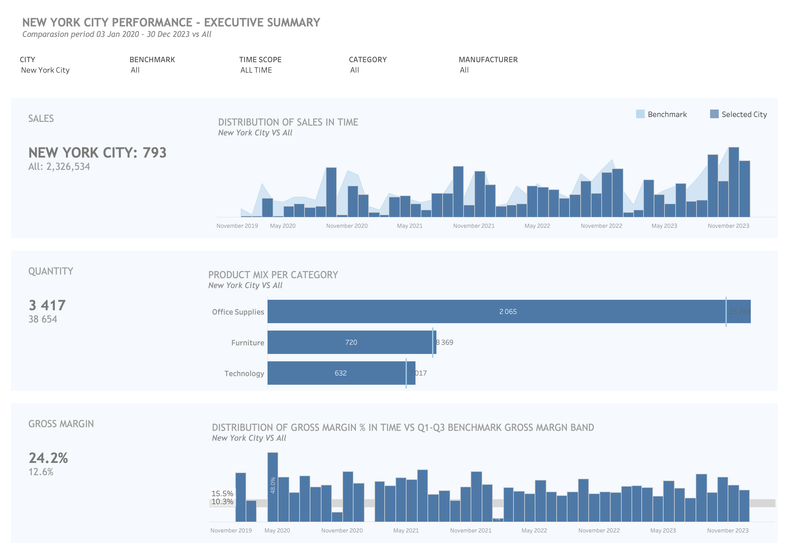
Member Performance vs Benchmark
By leveraging the power of Tableau's LOD (Level of Detail) functions, I created a dynamic and powerful visualisation by allowing users to analyse and compare data subsets within the context of the entire dataset. This comparison would not have been possible using a SQL query alone, as the WHERE clause restricts the ability to preview both the subset and the complete dataset simultaneously. This enhanced functionality enabled stakeholders to make data-driven decisions with a comprehensive understanding of the relationships and patterns within the data.
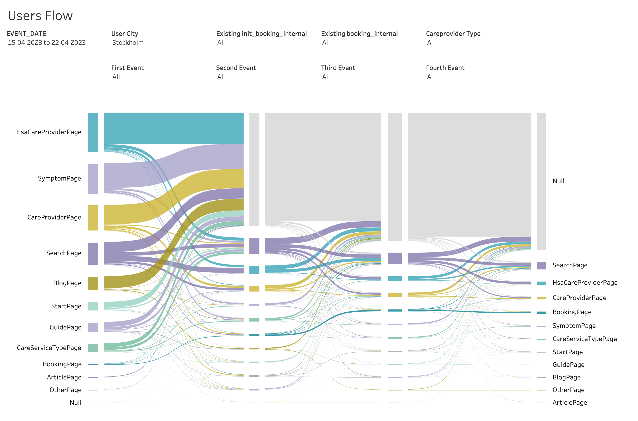
Saneky Flow Chart
By utilizing Tableau's features and functionality, I was able to present complex marketing data in a visually appealing and easily understandable format. I developed an interactive Sankey diagram that effectively showcased the flow of users across different stages of the campaign. The three levels of the Sankey chart provided a clear and intuitive visualization of the user journey, highlighting the transitions and interactions between various touchpoints.
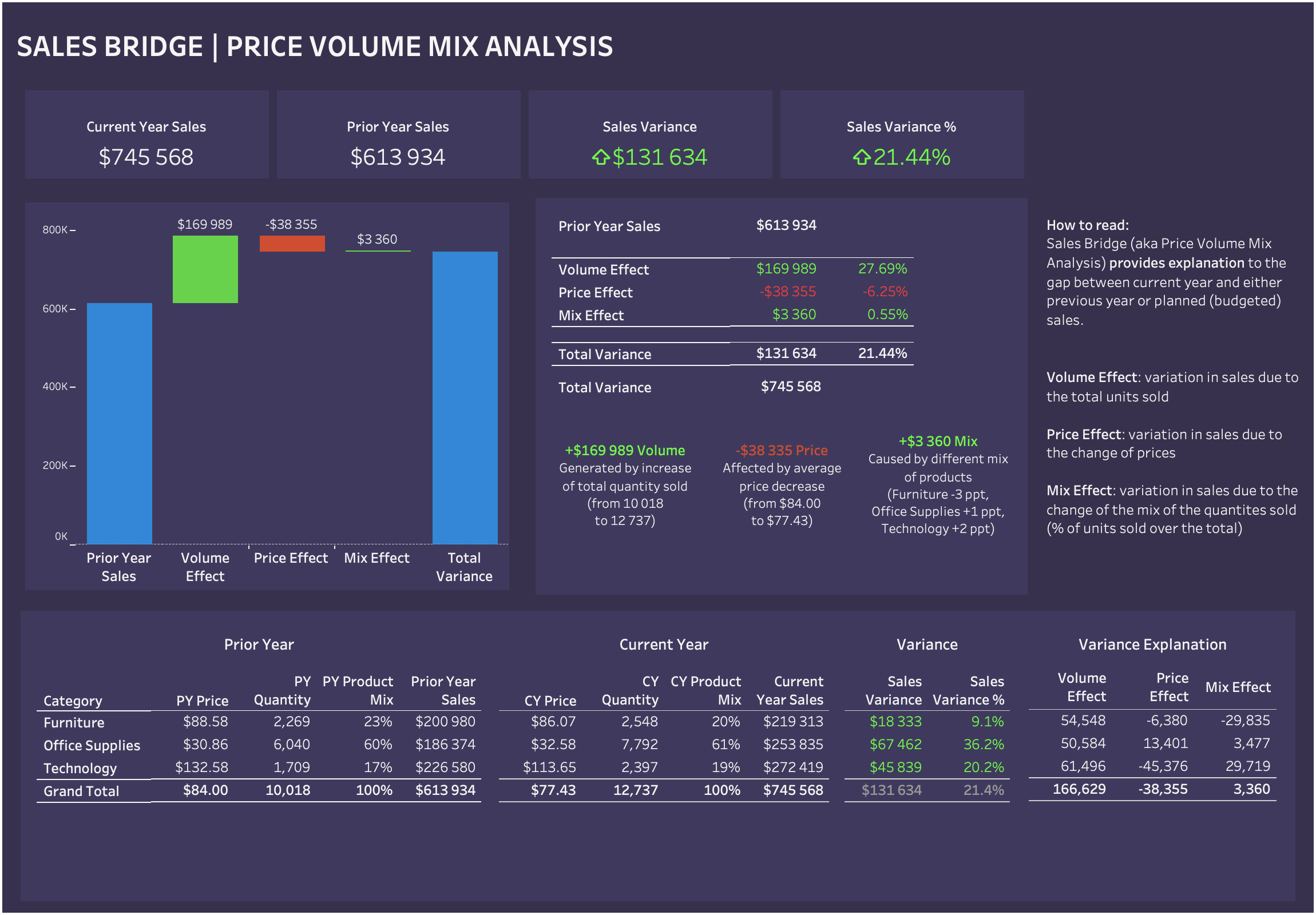
Sales Bridge | Variance Analysis
Sales Bridge (Price Volume Mix Analysis or Variance Analysis) showcases the pricing dynamics and their impact on the overall sales performance. The visualizations allowes stakeholders to explore the relationship between product prices, sales volumes, and revenue across different segments and time periods.The visualizations provid a clear understanding of how changes in pricing affects sales and profitability, enabling the identification of pricing strategies that drive revenue growth and maximize profitability. This is perfect example of transforming complex pricing data into actionable insights using Tableau, ultimately assisting the organization in making informed pricing decisions and optimizing their overall pricing strategy.
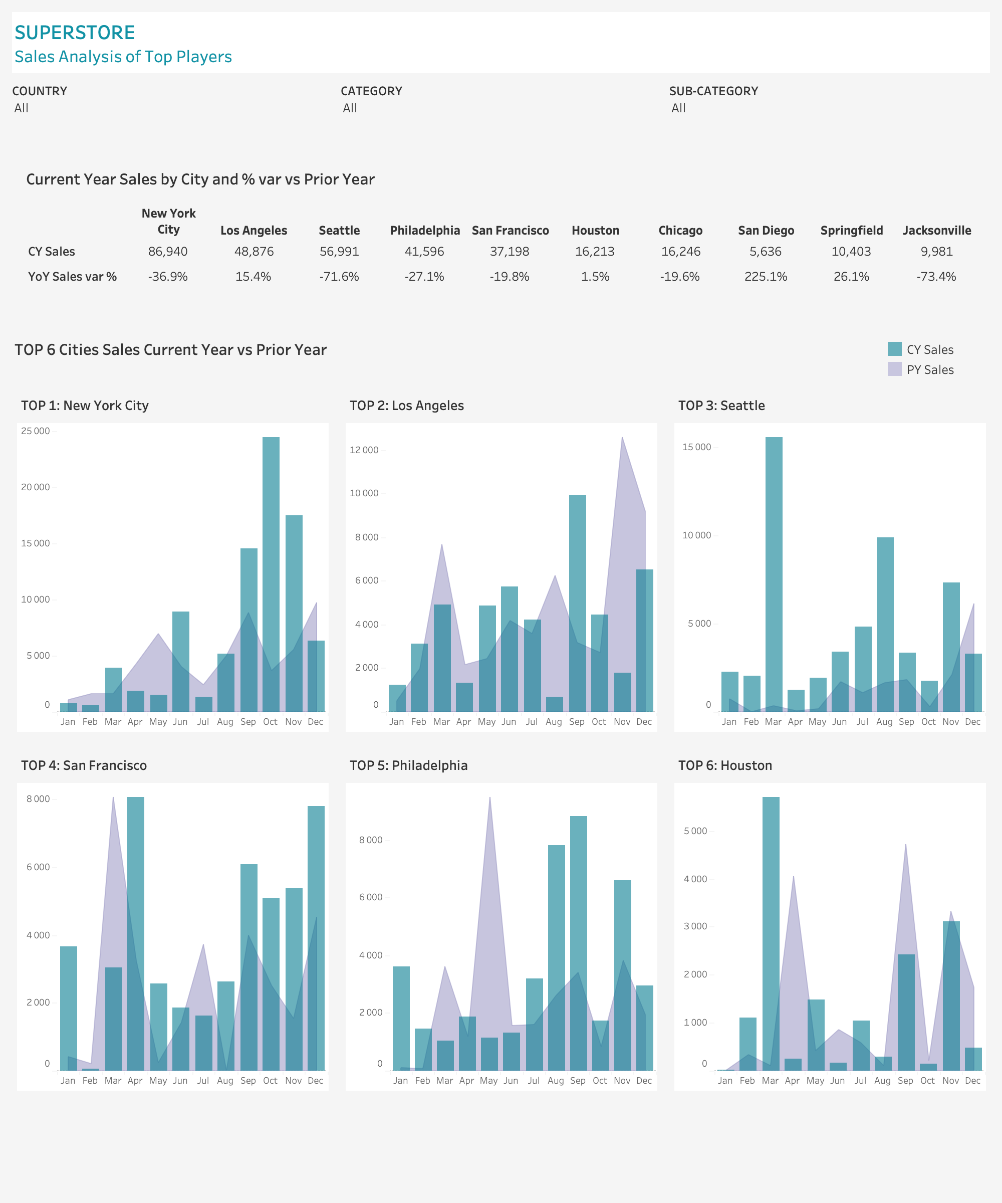
Top 6 Cities by Sales
The Tableau dashboard presenting a comprehensive sales analysis dashboard with a focus on city-level performance. Including dynamic selection feature enabled users to choose and compare the top 6 cities based on sales metrics. One notable advantage of this feature was the ability to accommodate cities of varying sizes while maintaining independent axes for each chart. This ensured accurate and meaningful comparisons of sales distribution, trends and patterns across the selected cities, regardless of their individual magnitudes.
Glassdoor Company Reviews
Analysis of company reviews given by current and former employees in four industries. Complete cross-section across multiple dimensions. Practical usage of trigonometric functions to draw radar chart.
Warsaw Car routes in Kepler
Dynamic visualisation of car drivers in Warsaw based in Justtag Group data.
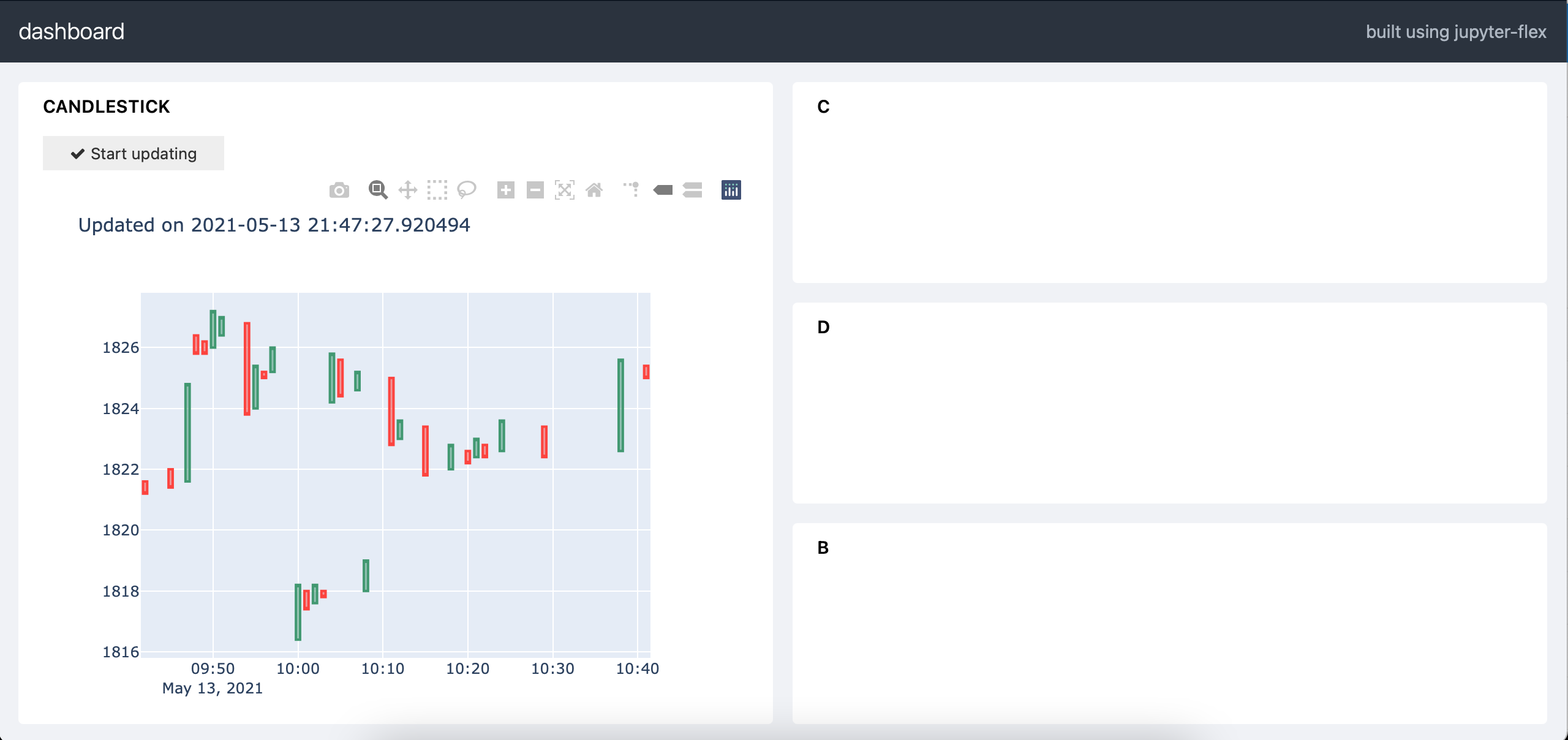
Jupyter Flex Dashboard for Monitoring Stock Market Data
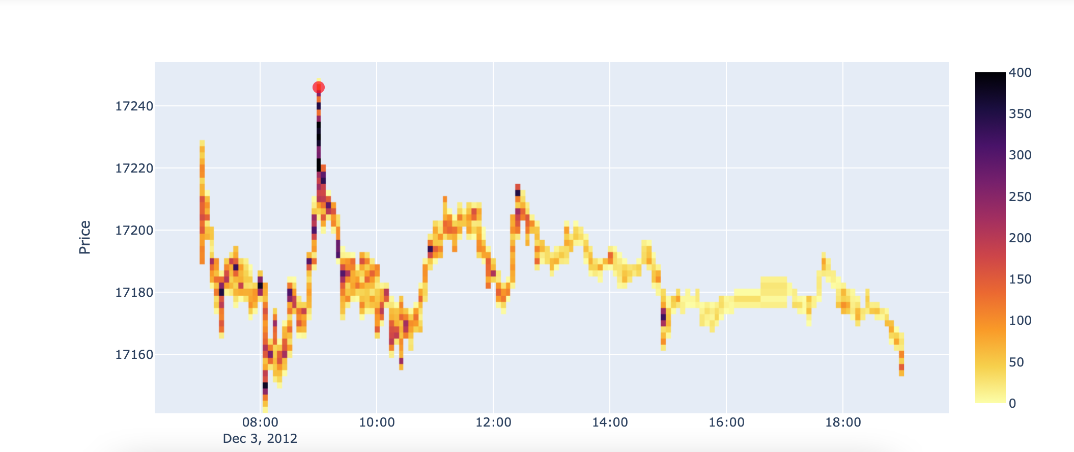
Stock Market Heatmap
Page template forked from evanca