Kasia Wrona

Data Scientist at Team Internet Group PLC (LON:TIG)
Freelance Tableau Developer and Data Analytics Engineer
Data Analytics Mentor at CareerFoundry
Data visualisation professional and machine learnig enthusiast
LinkedIn Profile
GitHub Repo
Tableau Public
Leveraging Tableau’s LOD Functions for Dynamic Data Analysis
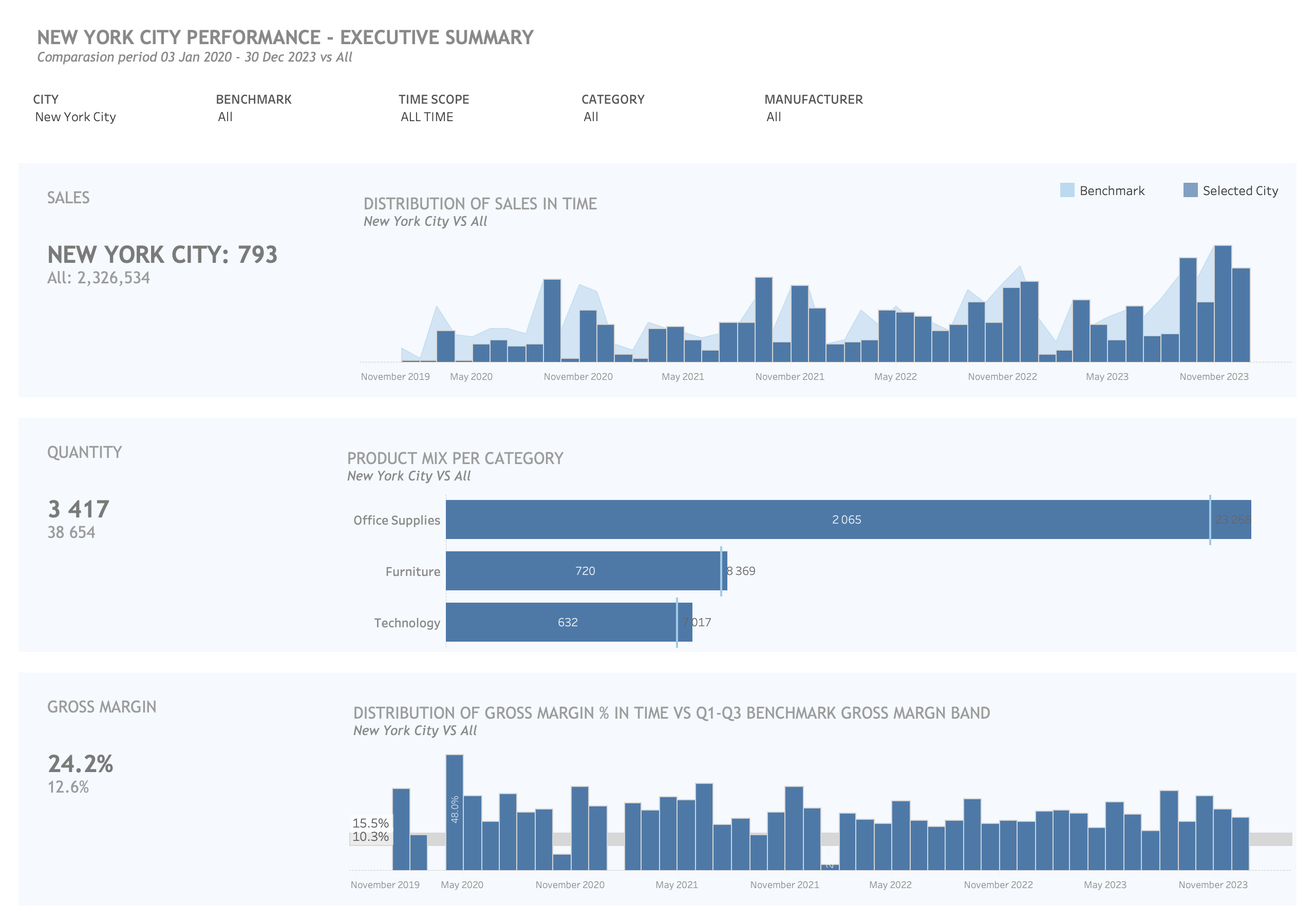
Member Performance vs Benchmark Dashboard
Project Overview:
In this Tableau project, I harnessed the formidable capabilities of Tableau’s Level of Detail (LOD) functions to create a dynamic and robust visualization platform. This innovative approach allows users to delve deep into the data, analyze specific subsets, and make informed comparisons within the broader context of the entire dataset. By using LOD functions, we achieved a level of analytical depth that would have been challenging to attain using conventional SQL queries alone. The ability to simultaneously view both subsets and the complete dataset empowers stakeholders to make data-driven decisions with a holistic understanding of the data’s intricate relationships and patterns.
Data Source:
Our primary data source for this project is the Tableau “Superstore” dataset. This dataset is widely recognized as an exemplary resource for data exploration and analysis. It encompasses a diverse range of sales-related information, making it well-suited for a project of this nature. The Superstore dataset is known for its cleanliness, completeness, and relevance to real-world business scenarios, making it a reliable foundation for our analysis.
Key Features:
Dynamic Filters:
The main view of this Tableau project incorporates three dynamic filters to enhance the user experience:
-
City: Allows users to filter data based on specific cities, providing localized insights.
-
Benchmark: Enables users to select a benchmark, aiding in comparative analysis.
-
Timescope: Offers flexibility in choosing the time frame for data exploration.
Visualizations:
The heart of this project lies in its interactive visualizations:
-
Sales: Visualized using a chart with a light blue color to represent benchmark data. This provides a clear distinction between benchmark and selected city sales data.
-
Quantity: Depicted through a chart that offers insights into the quantity of products sold.
-
Gross Margin: Illustrates the gross margin in a visually compelling format.
Why the Superstore Dataset is Ideal:
The Superstore dataset serves as an ideal data source for this project due to several compelling reasons:
-
Diversity: It contains a wide range of data, including sales, orders, products, and customer details, facilitating multifaceted analyses.
-
Cleanliness: The data is well-structured and clean, minimizing the need for extensive data preparation.
-
Relevance: Superstore data closely resembles real-world retail and e-commerce scenarios, making it highly relevant to a broad audience.
-
Availability: Being a sample dataset within Tableau, it’s readily accessible to users, simplifying project sharing and collaboration.
Conclusion:
This Tableau project is a testament to the power of advanced analytics and data visualization. By leveraging Tableau’s LOD functions and the Superstore dataset, we’ve created a user-friendly platform that empowers stakeholders to gain deep insights, make informed decisions, and explore the intricate relationships within their data. The dynamic filters and visualizations enhance the analytical experience, ensuring that users can extract maximum value from their data.